
PORTFOLIO
Culinary Industry | Business-to-Business | Aging & Dementia
Culinary Portfolio
OUR HOUSE SPECIALTY. THE LOVE OF FOOD!
We have been fortunate to work with many incredible restaurateurs, food producers, and other amazingly talented individuals in the Culinary Industry. Ongoing trend research and years of interaction have provided us with insights and a deep understanding of their business and marketing needs. When working with us, culinary clients benefit from a creative firm that gets it.
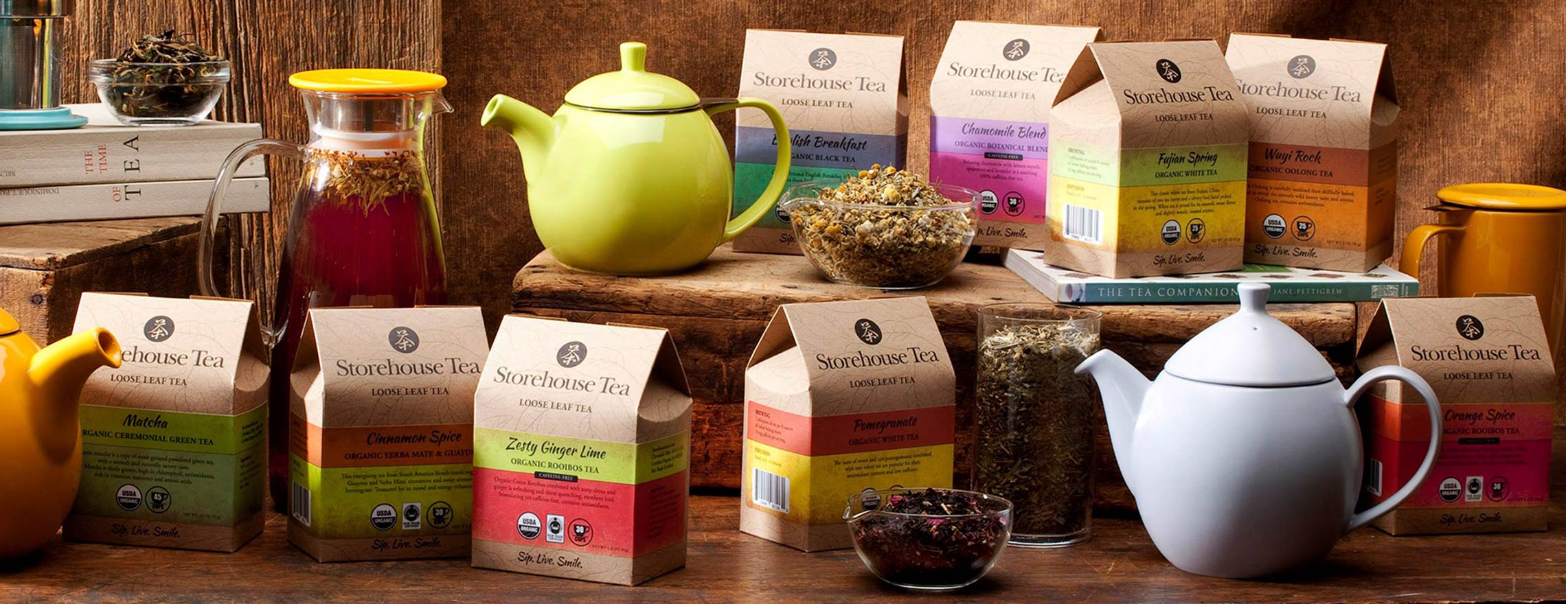
Storehouse Tea
Consumer Product Packaging (CPG)
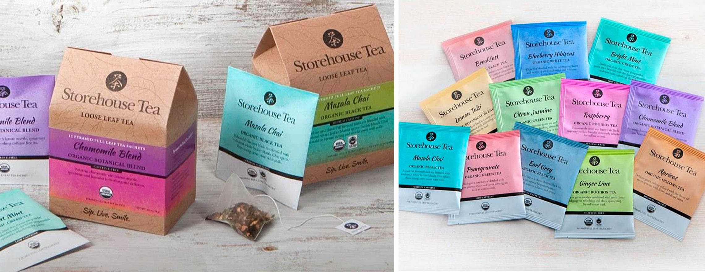
Storehouse Tea
Branding | Logo, Consumer Product Packaging (CPG)
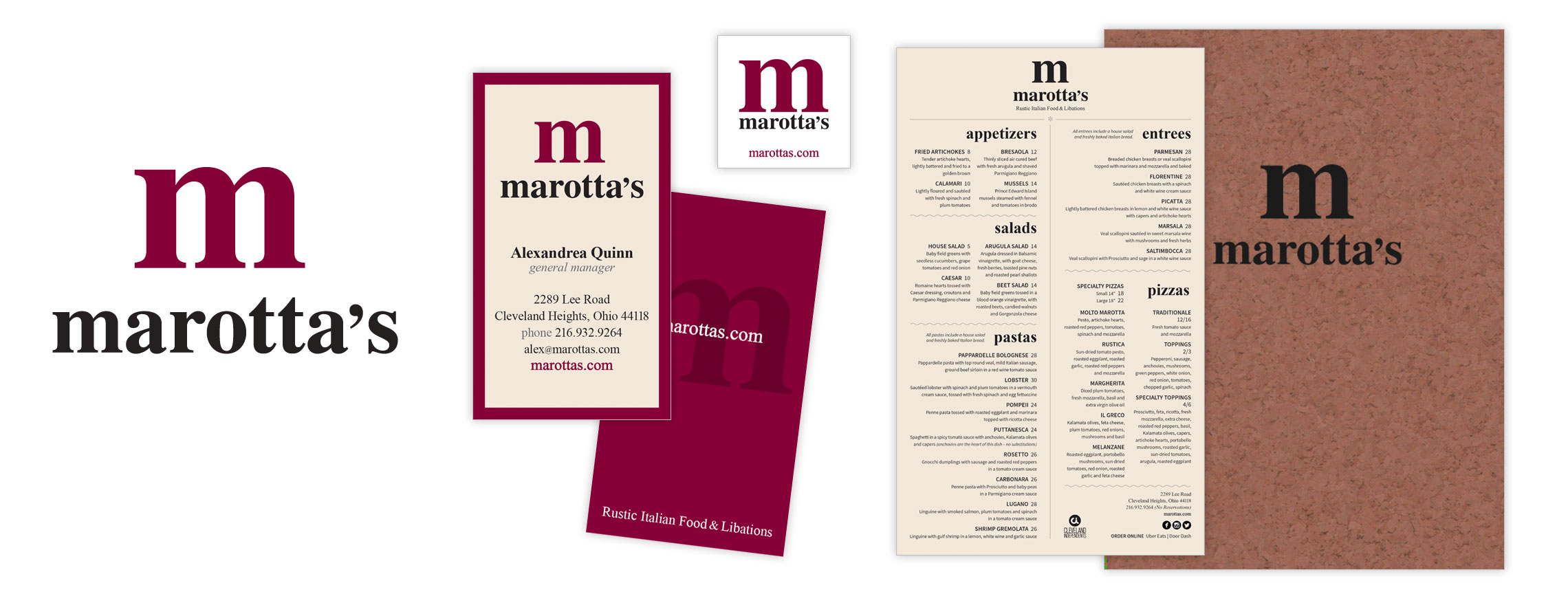
Marotta’s
Branding | Logo, Corporate Identity, Menus
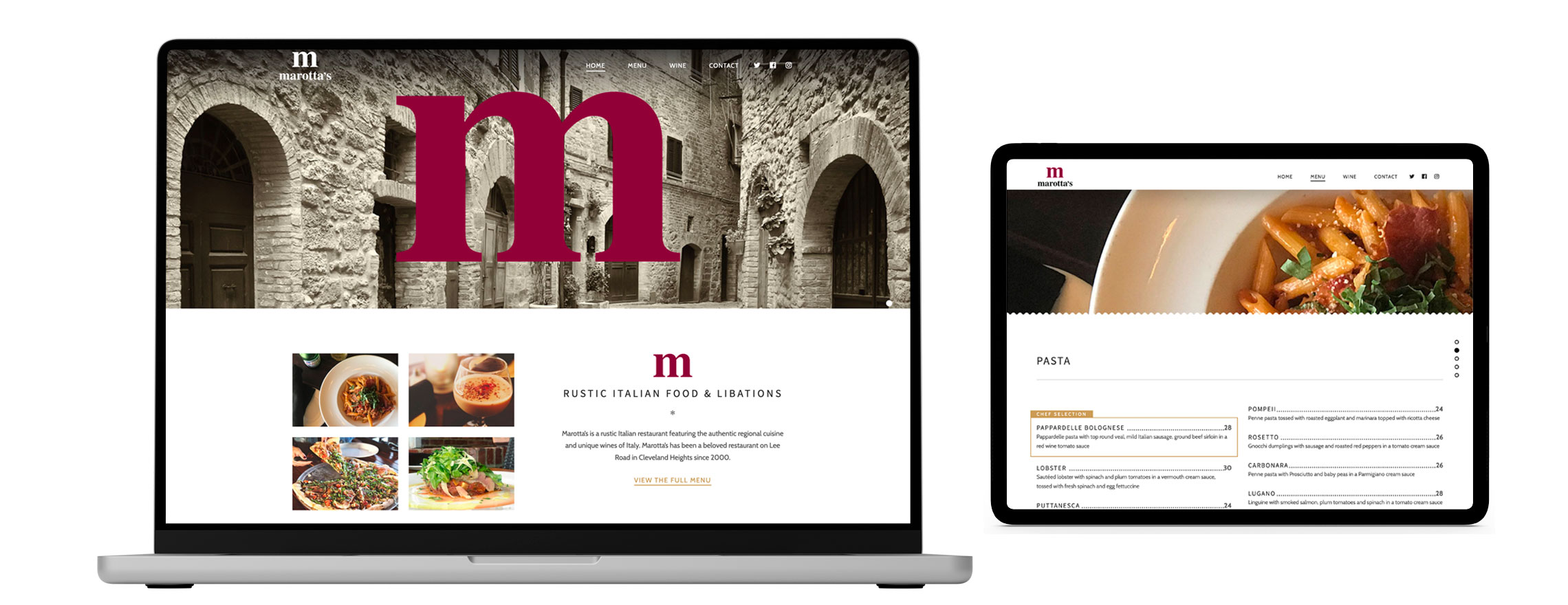
Marotta’s
Website
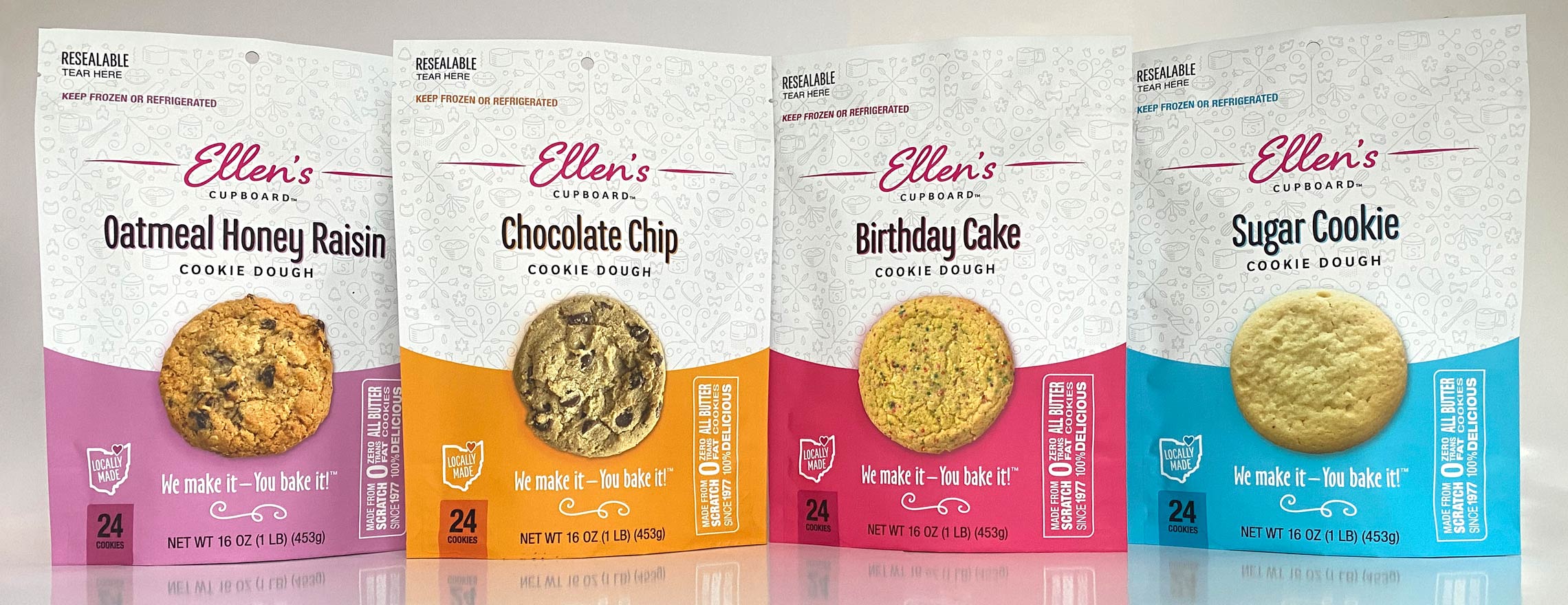
Ellen’s Cupboard
Consumer Product Packaging (CPG)
Ellen’s Cupboard
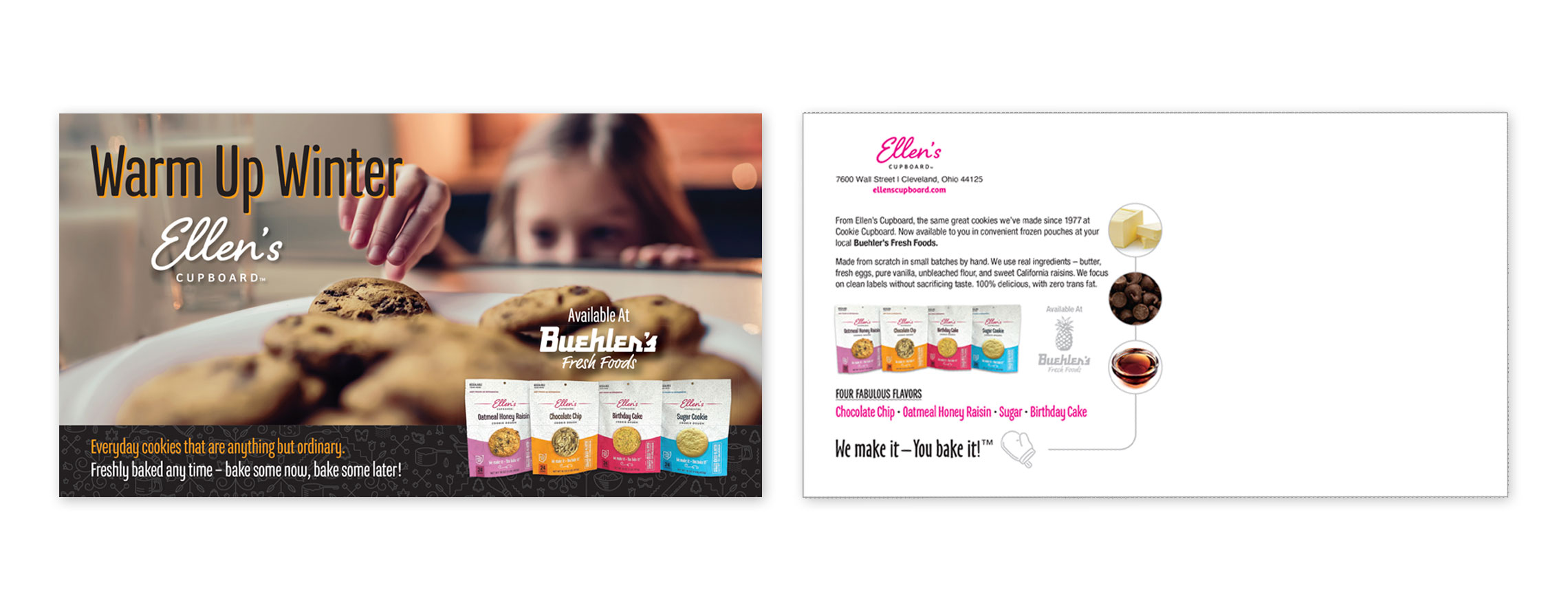
Promotional Postcard
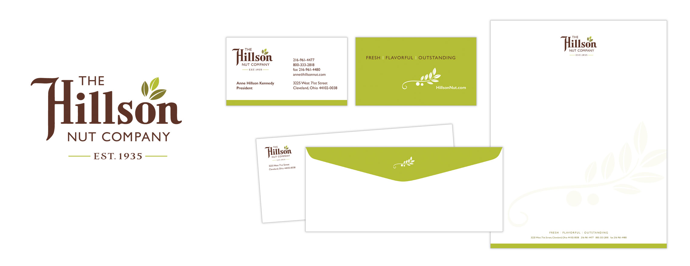
The Hillson Nut Company
Branding | Logo, Corporate Identity System
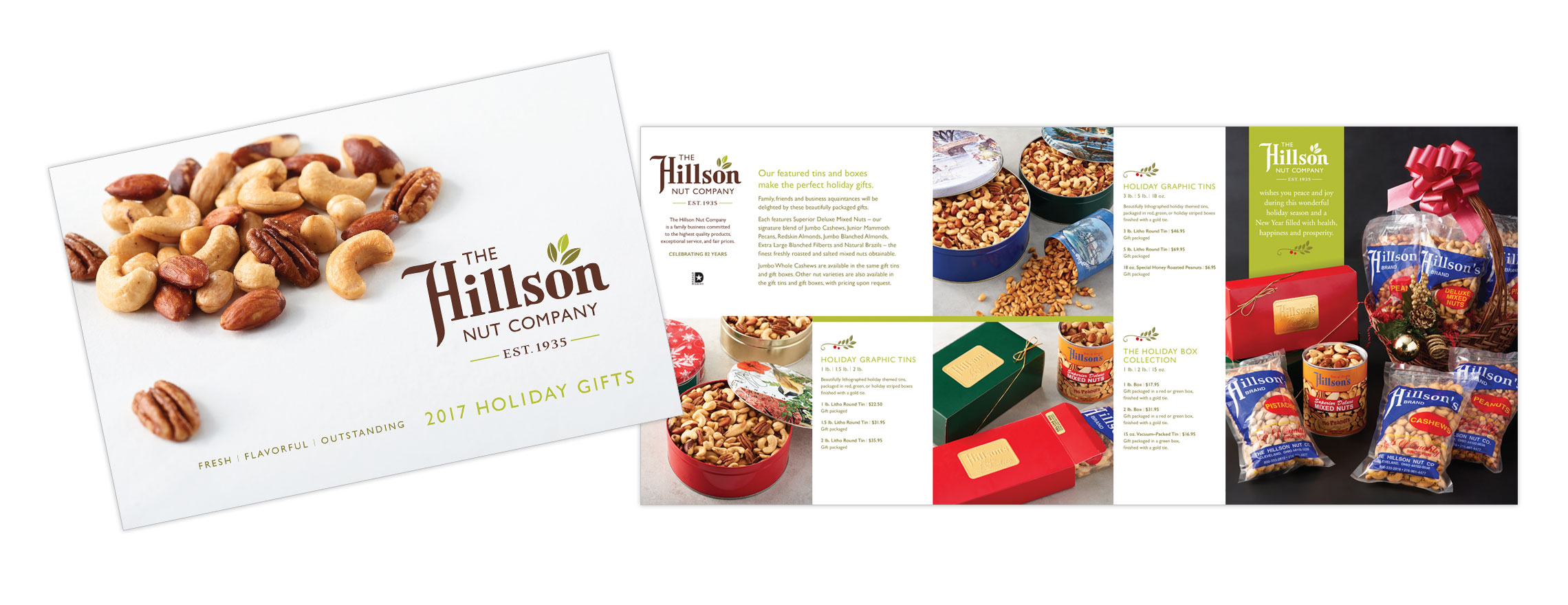
The Hillson Nut Company
Marketing Material | Catalog

Ellen’s Cupboard
Consumer Product Packaging (CPG)
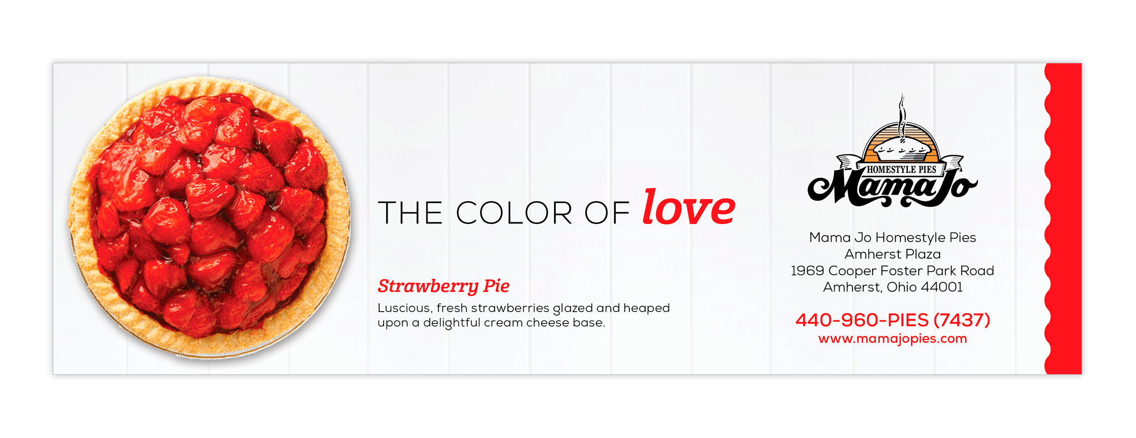
Mama Jo Homestyle Pies
Advertising
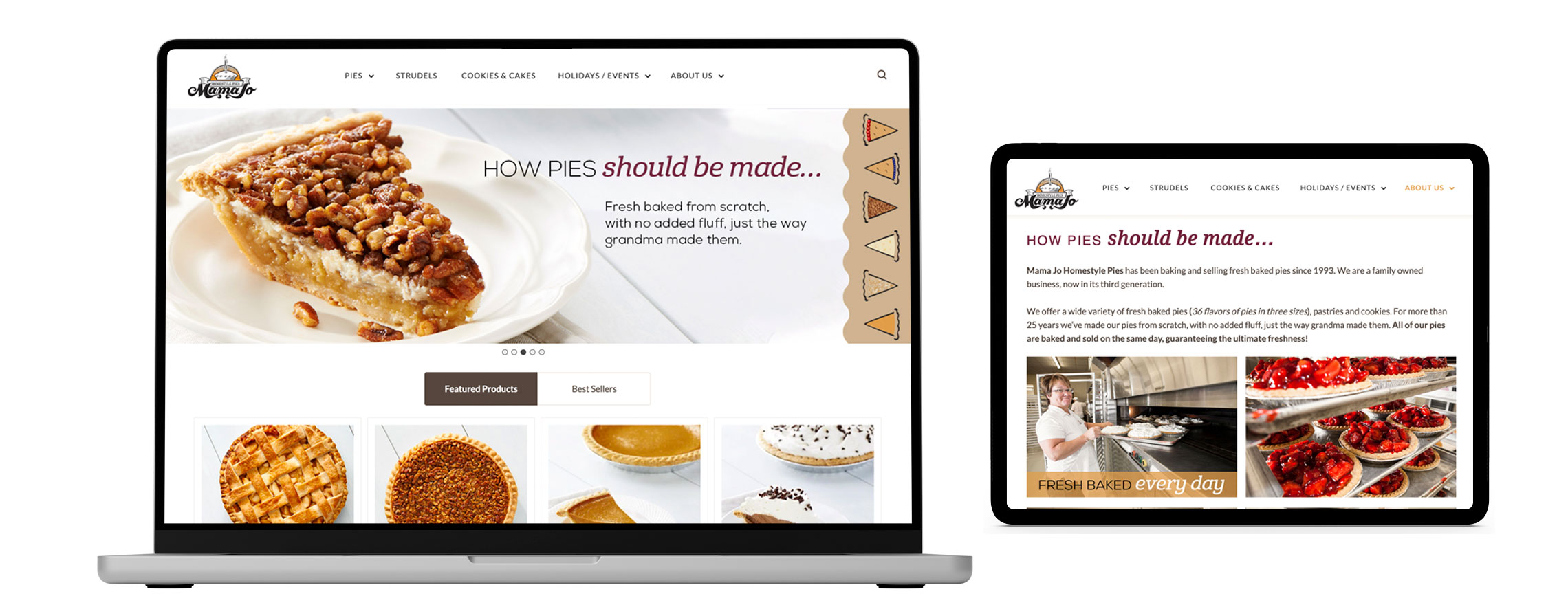
Mama Jo Homestyle Pies
Website
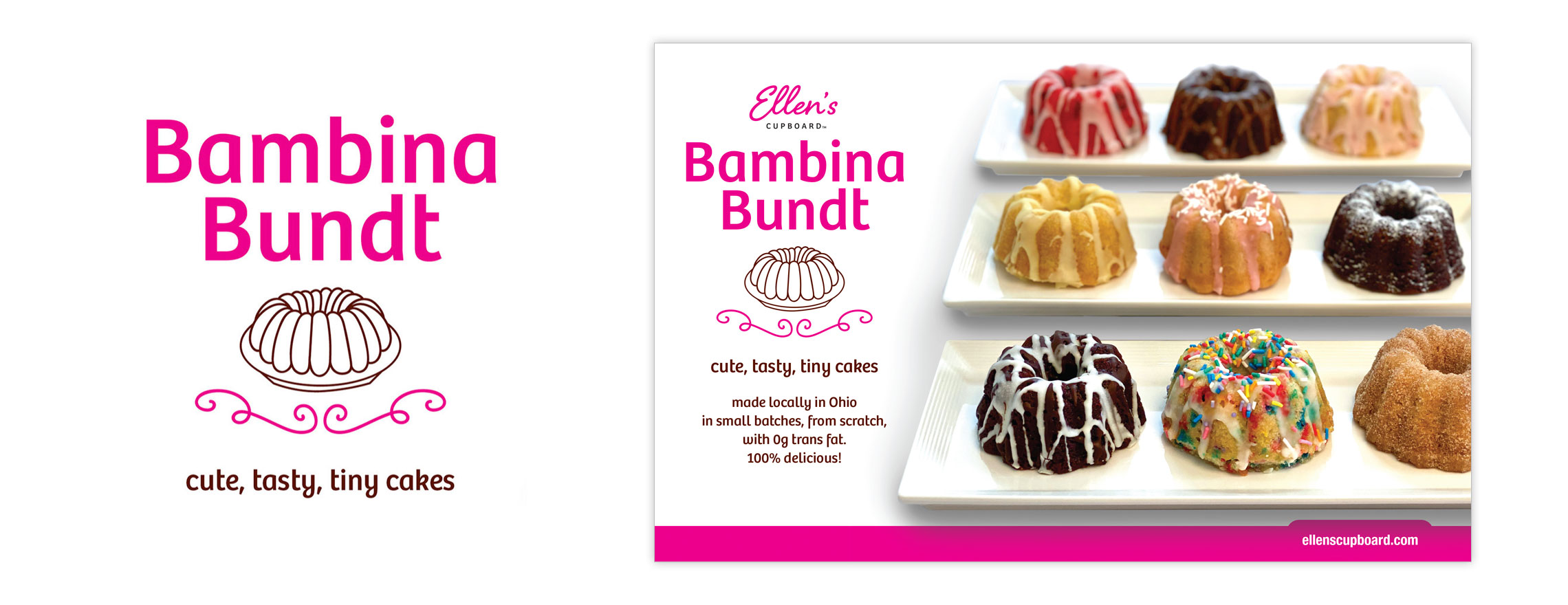
Bambina Bundt
Branding | Logo, In-Store Signage
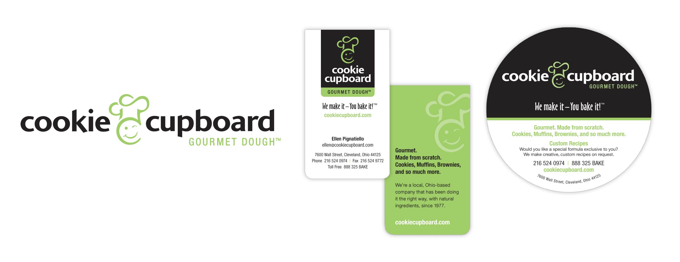
Cookie Cupboard Gourmet Dough
Branding | Logo, Corporate Identity, Labels
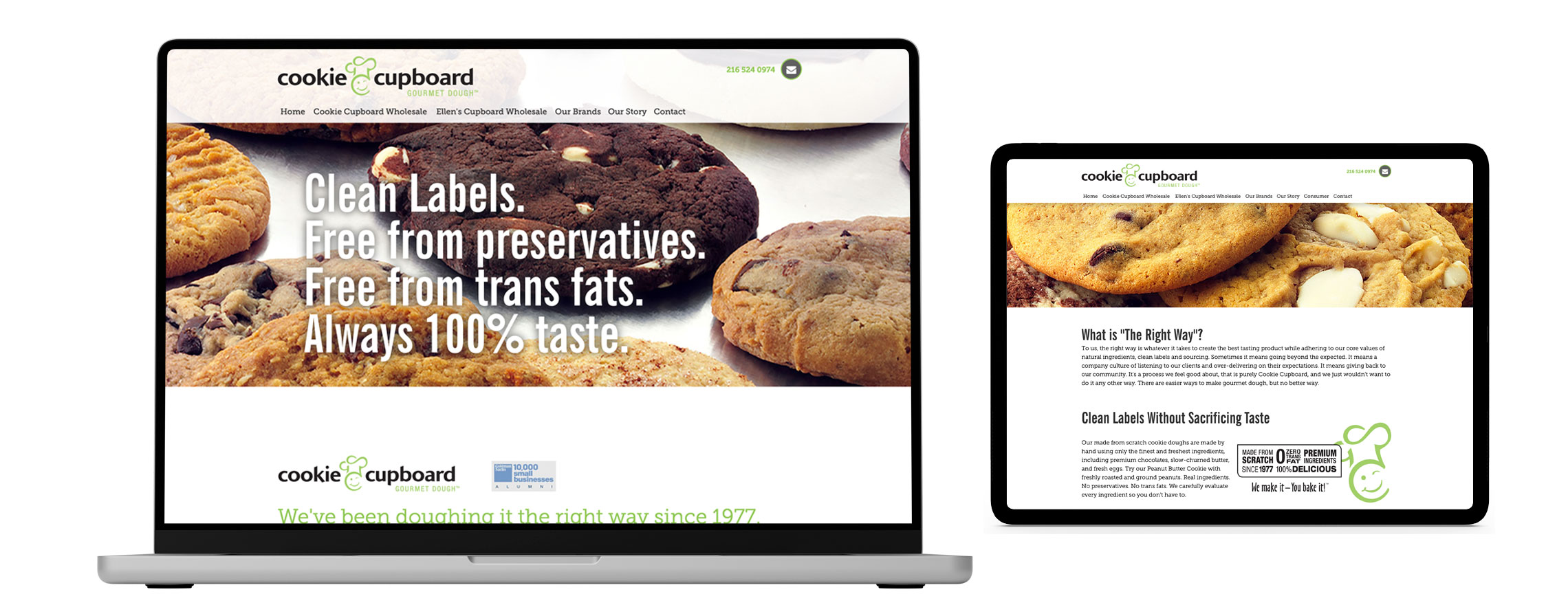
Cookie Cupboard Gourmet Dough
Website
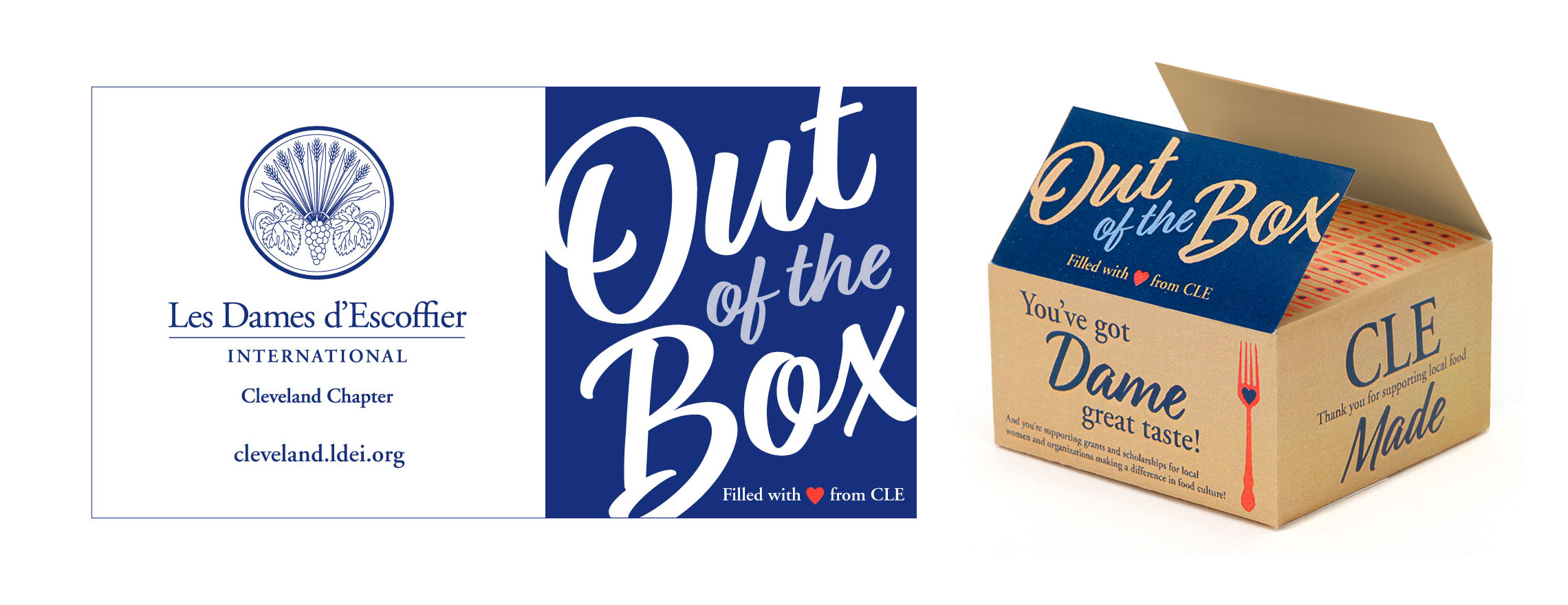
Les Dames d’Escoffier International, Cleveland Chapter
Branding, Packaging
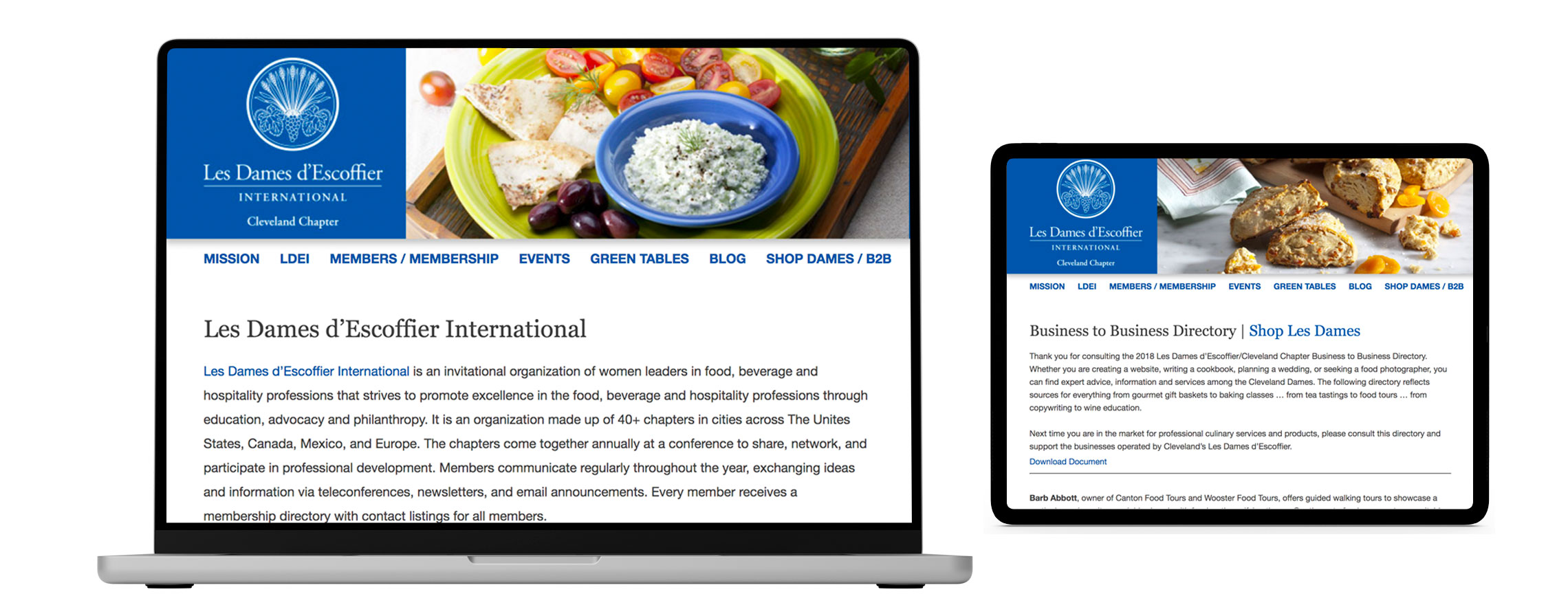
Les Dames d’Escoffier International, Cleveland Chapter
Website
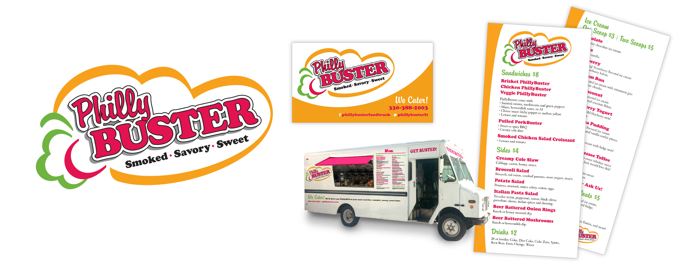
Philly Buster Food Truck
Branding | Logo, Menu, Truck Graphics
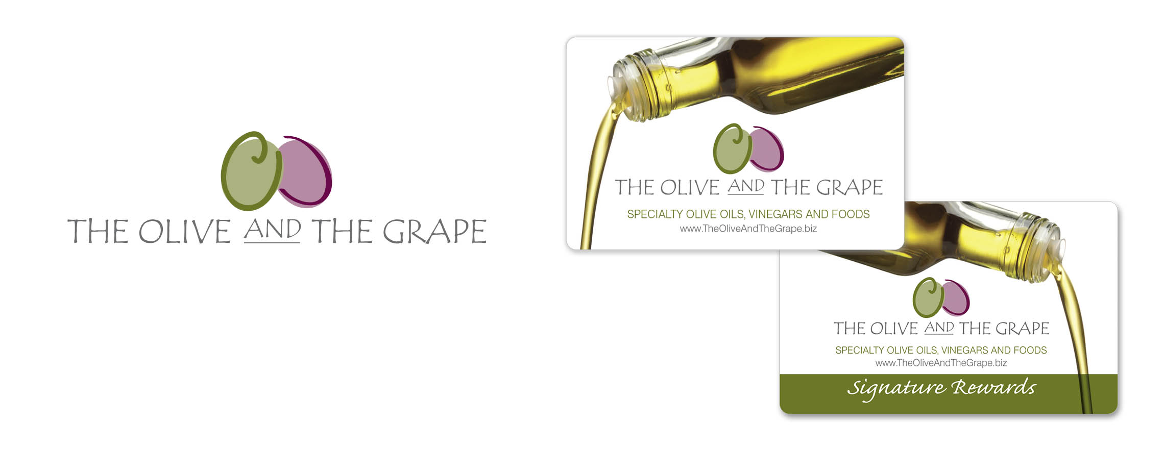
The Olive and the Grape
Branding | Logo, Gift Cards
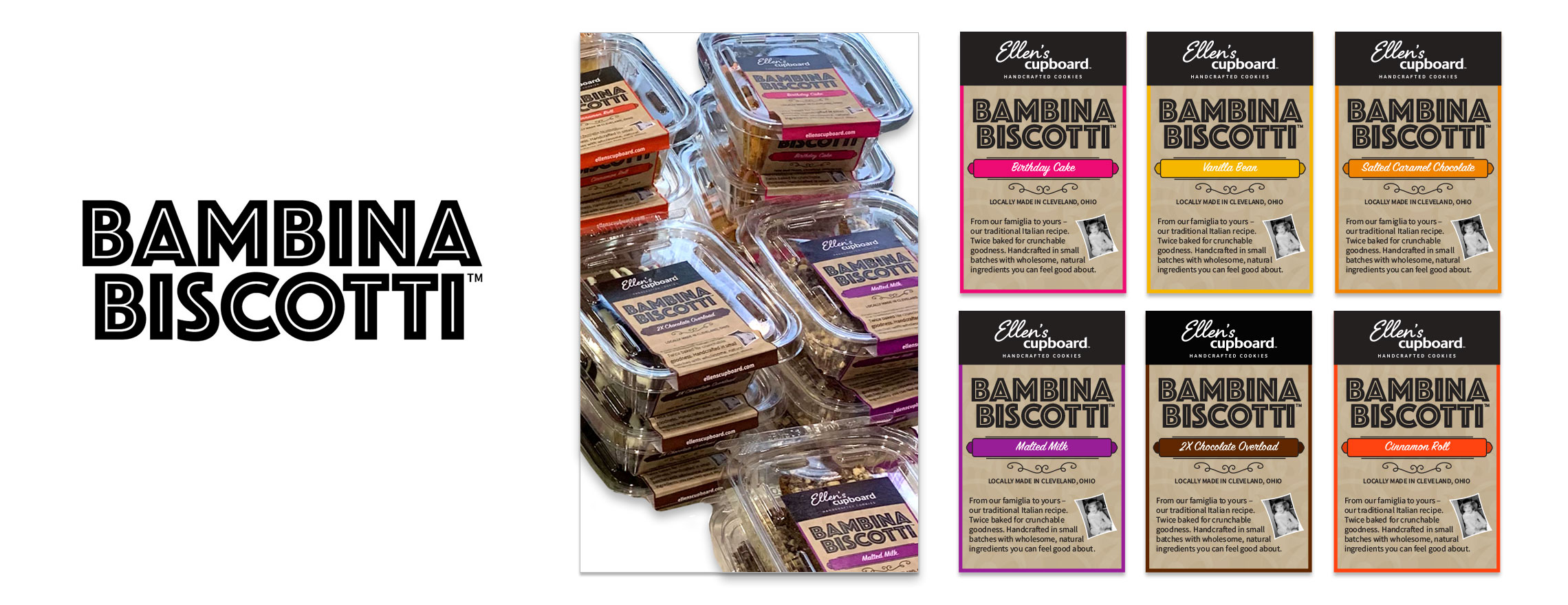
Bambina Biscotti
Branding | Logo, Packaging Labels
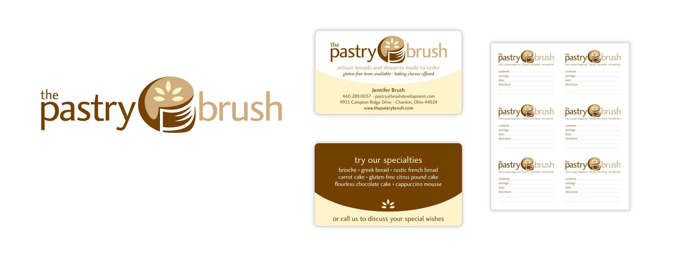
The Pastry Brush
Branding | Logo, Corporate Identity, Labels
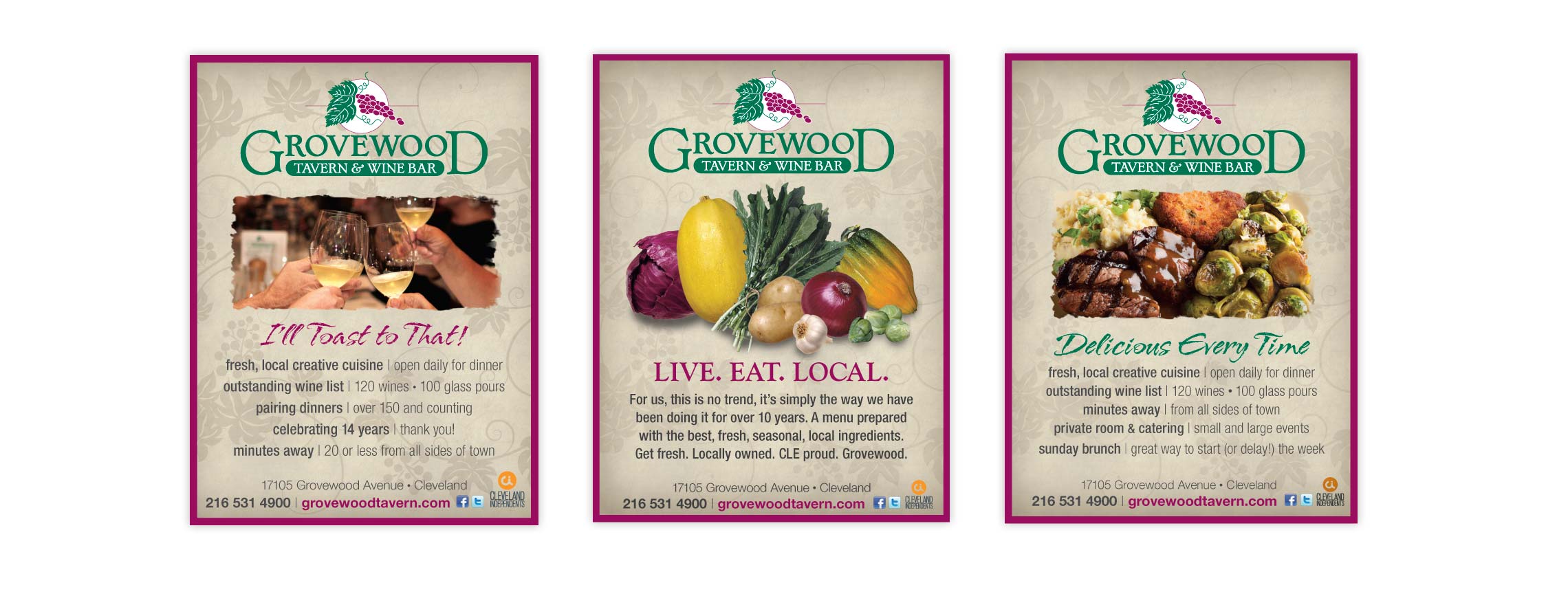
Grovewood Tavern & Winebar
Advertising

Carso Rosso Winery
Website
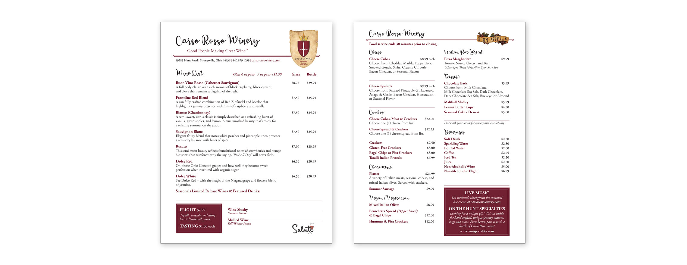
Carso Rosso Winery
Menu
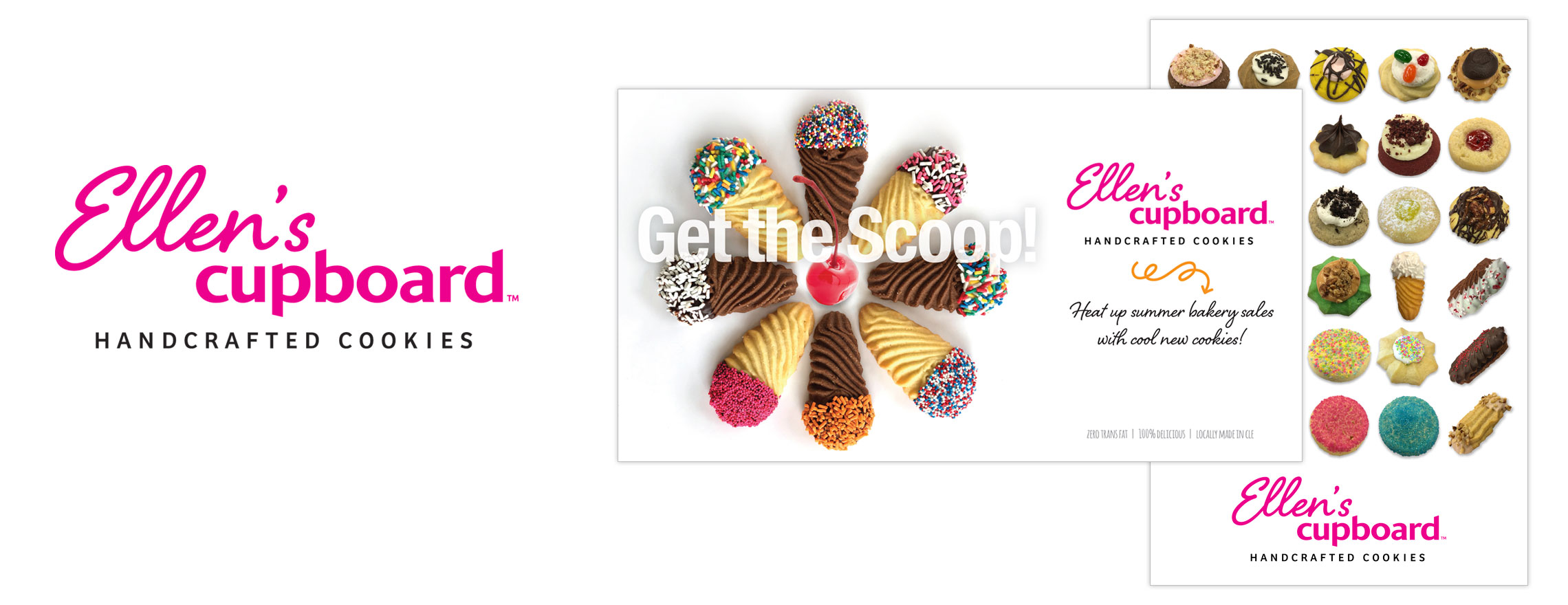
Ellen’s Cupboard Handcrafted Cookies
Branding | Logo, Postcard, Poster
Business-to-Business Portfolio
UNIQUE PERSPECTIVE
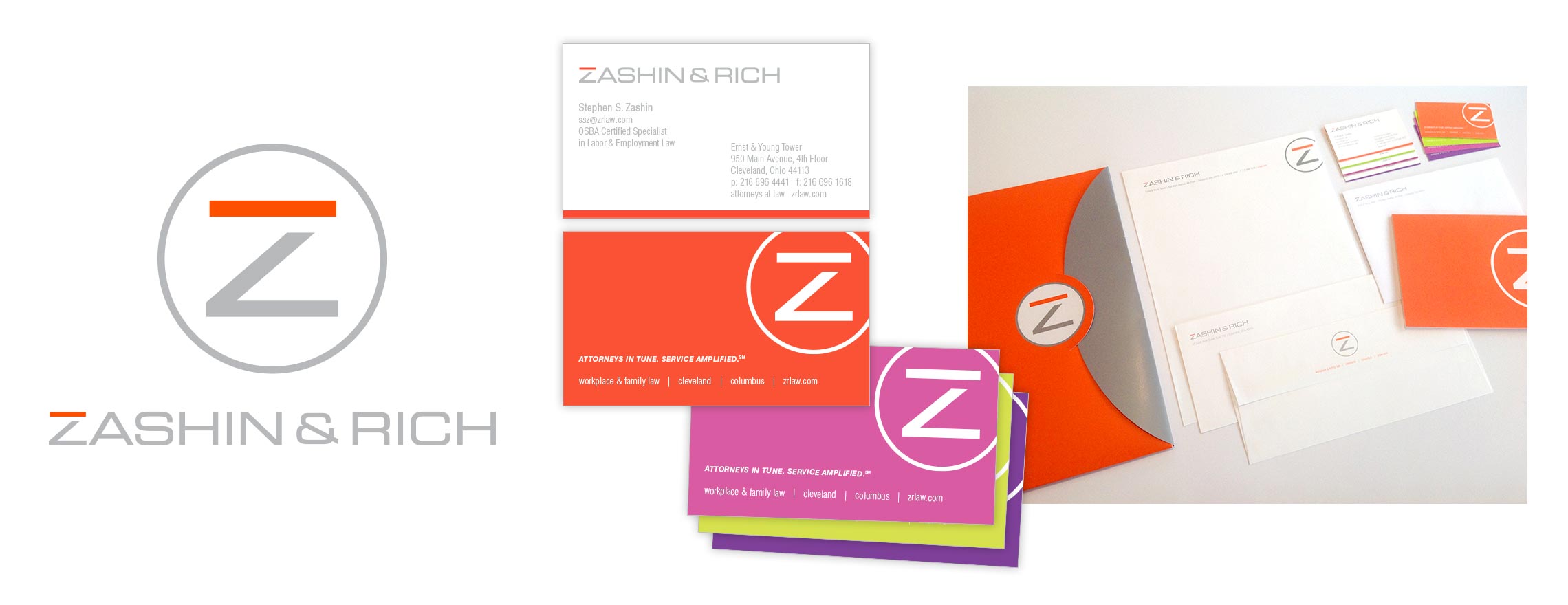
Zashin & Rich
Branding | Logo, Corporate Identity System
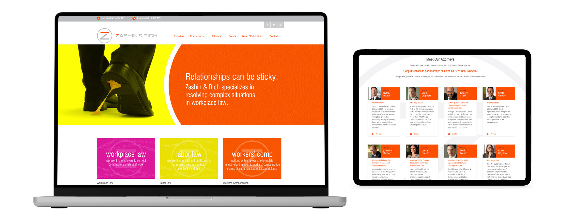
Zashin & Rich
Website
Goldberg Companies
Advertising
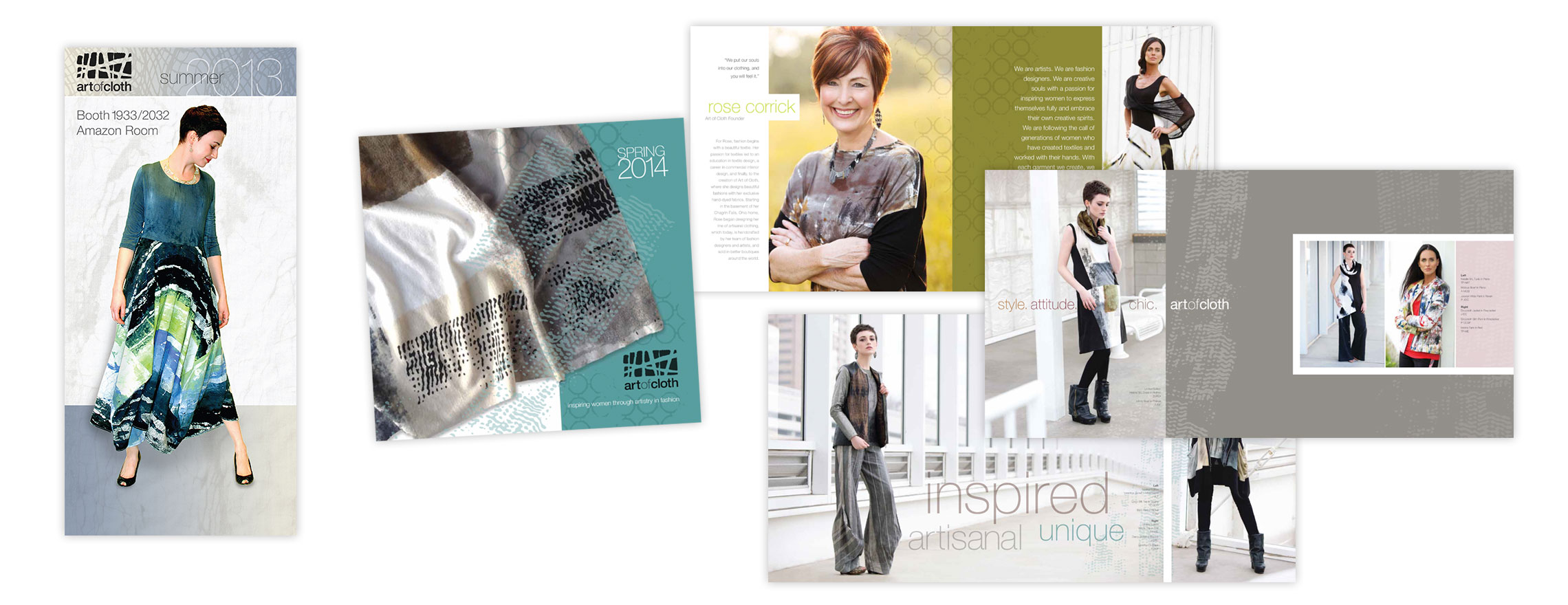
The Art of Cloth
Marketing Material
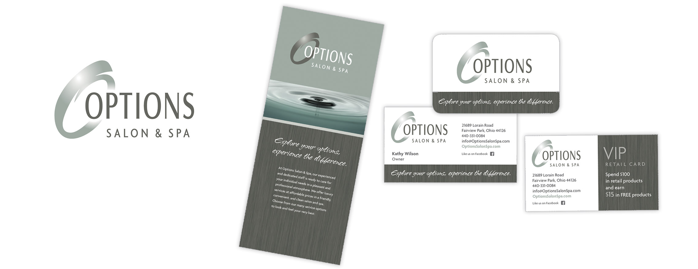
Options Salon & Spa
Branding | Various Collateral
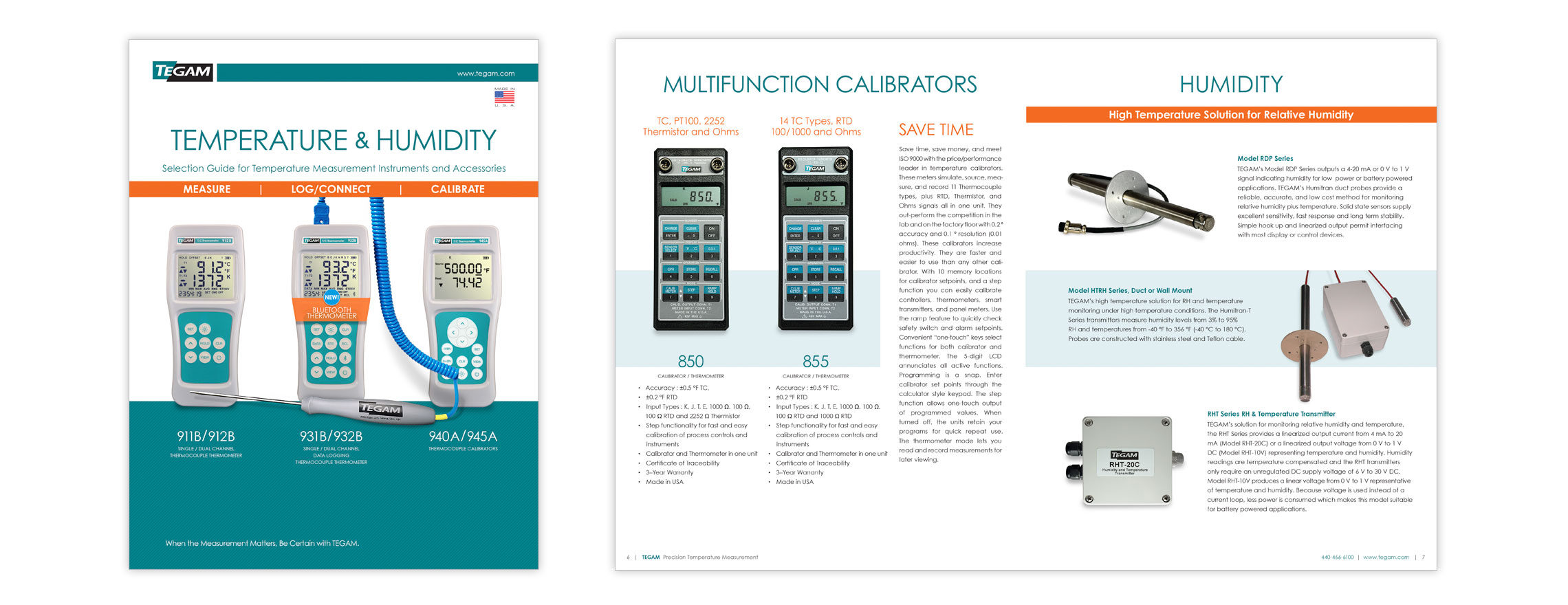
TEGAM
Product Brochure
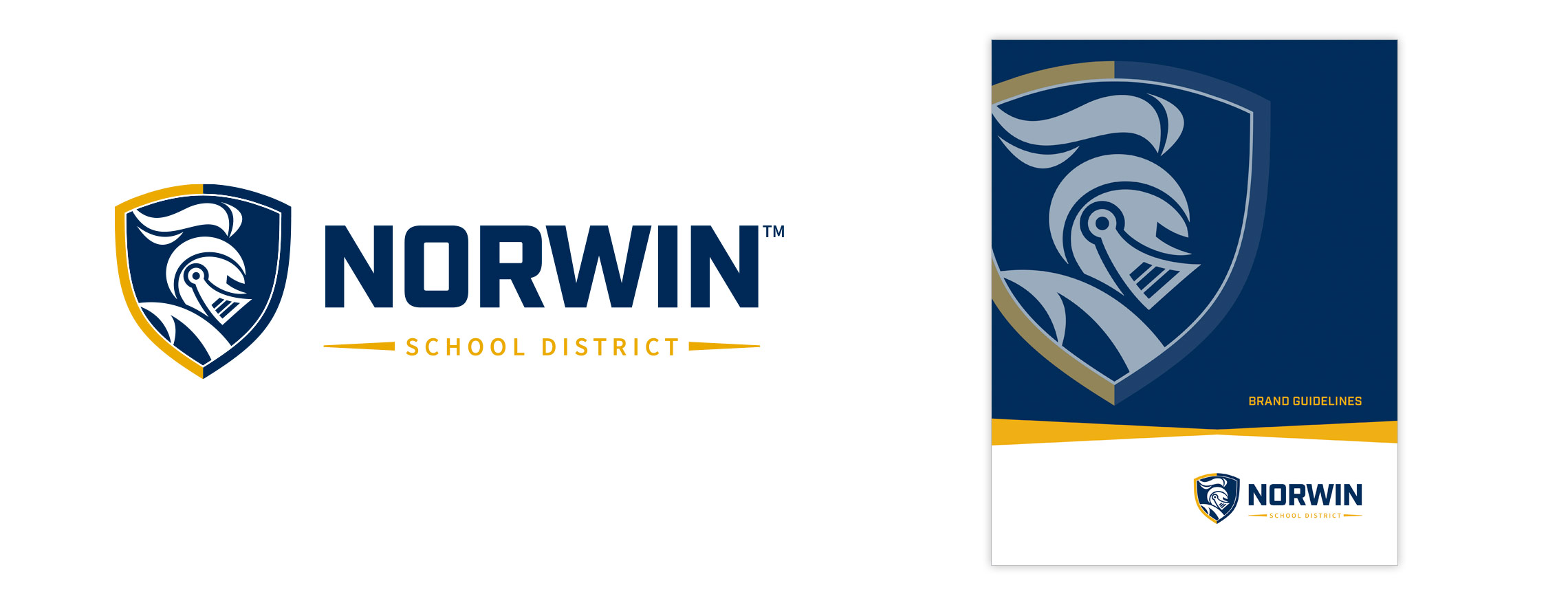
Norwin School District
Branding | Logo, Brand Standards, Brand Guidelines Book
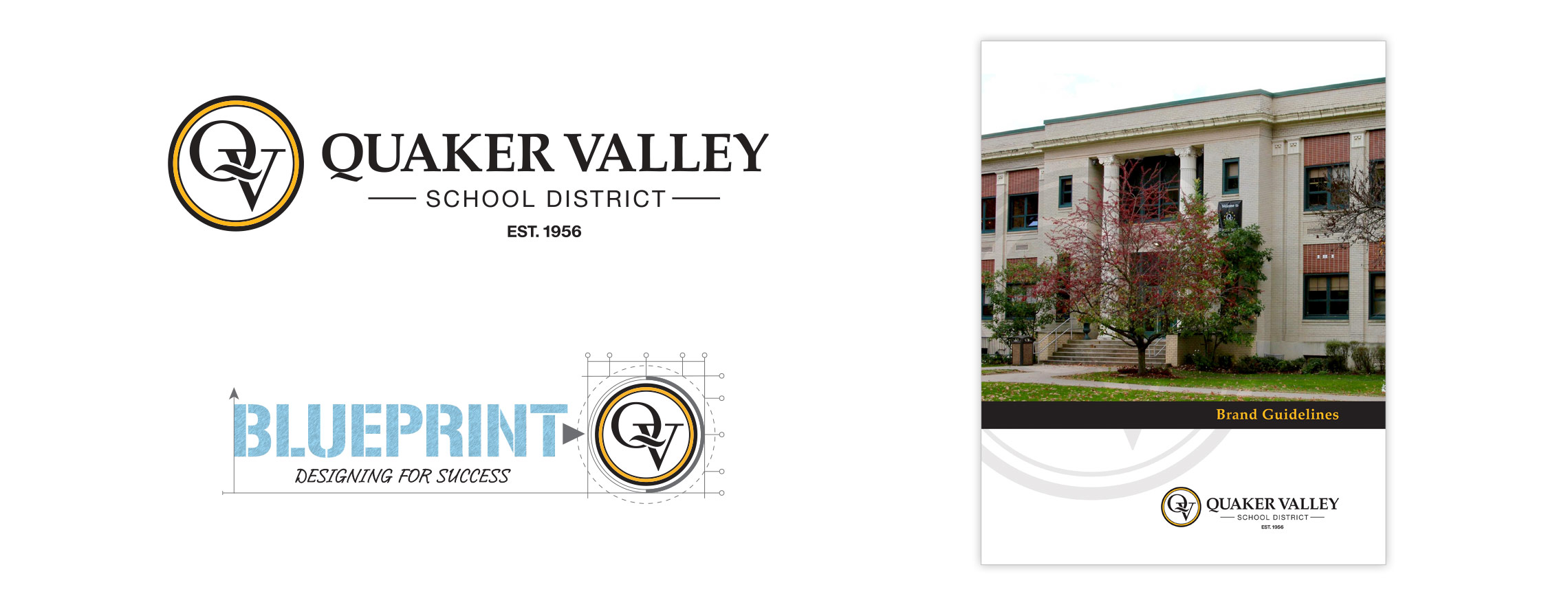
Quaker Valley School District
Brand Refresh | Logos, Brand Standards, Brand Guidelines Book
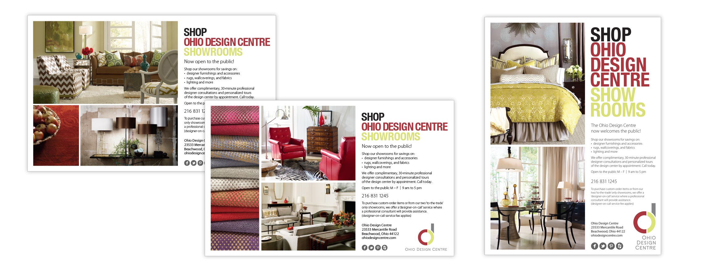
Ohio Design Centre
Advertising
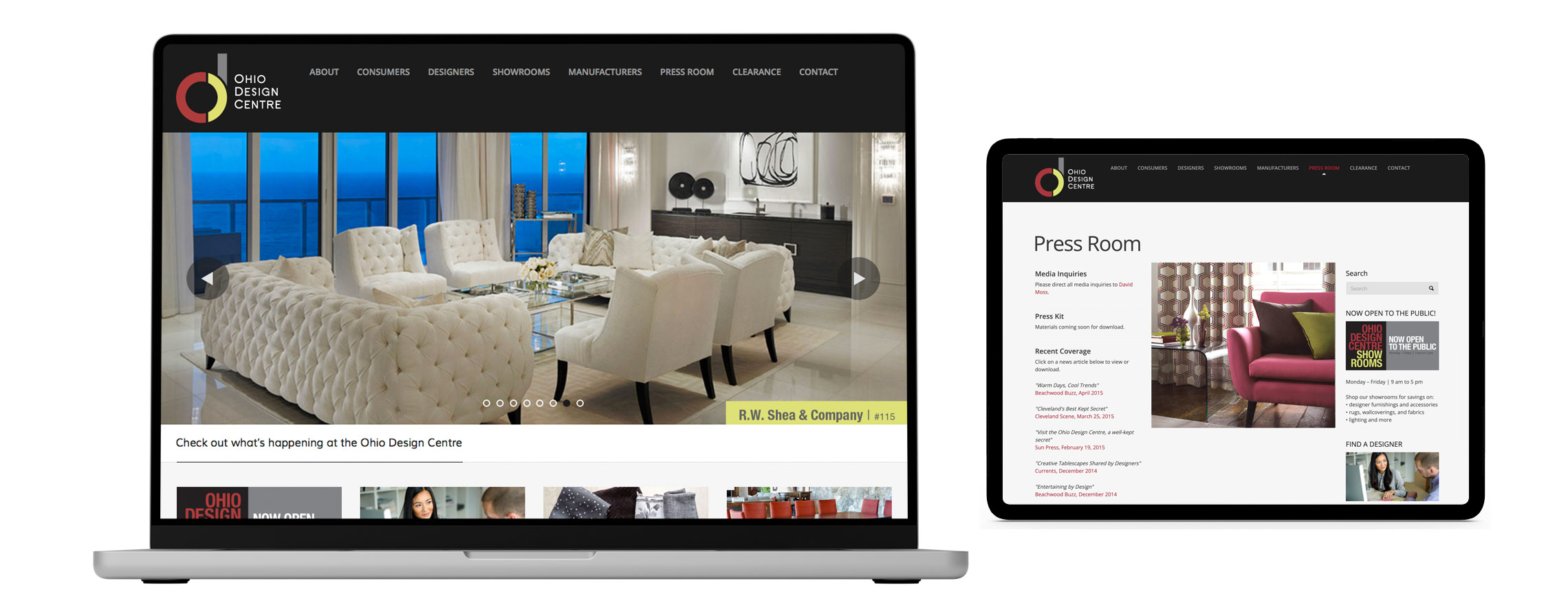
Ohio Design Centre
Website
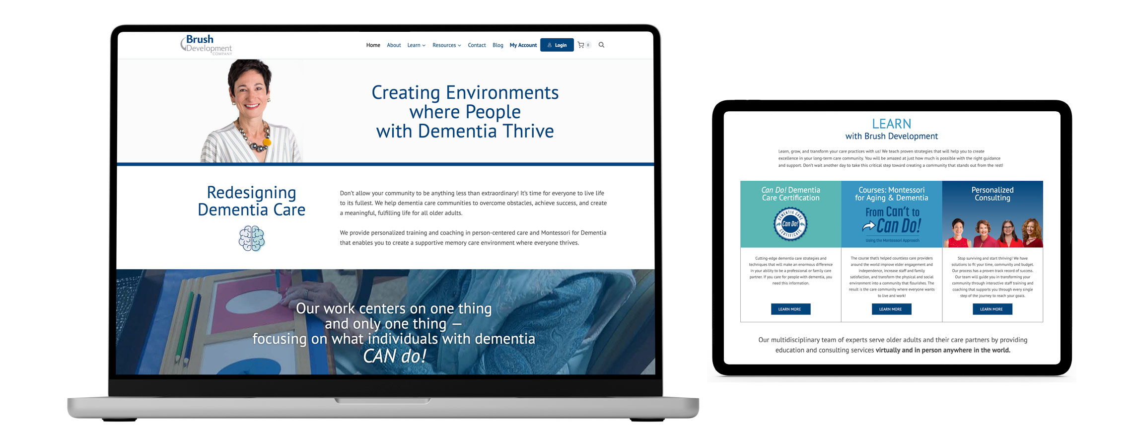
Brush Development
Branding | Logo, Website
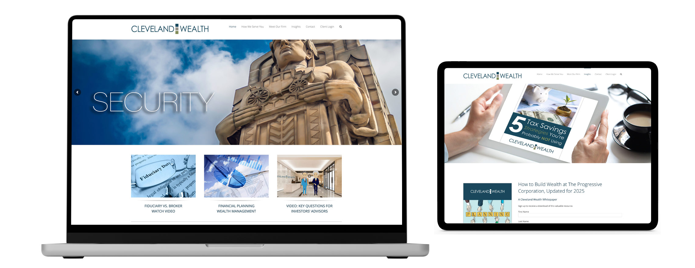
Cleveland Wealth
Website
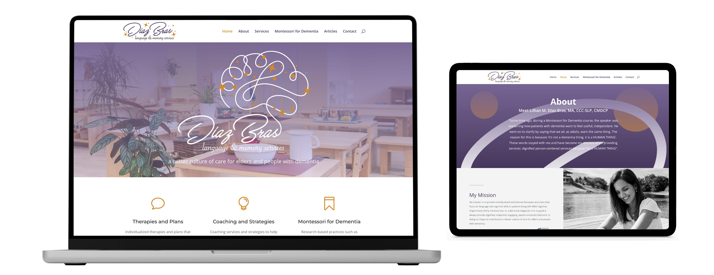
Díaz Bras, Language & Memory Services
Website

J&M Die Casting
Branding | Logo, Website
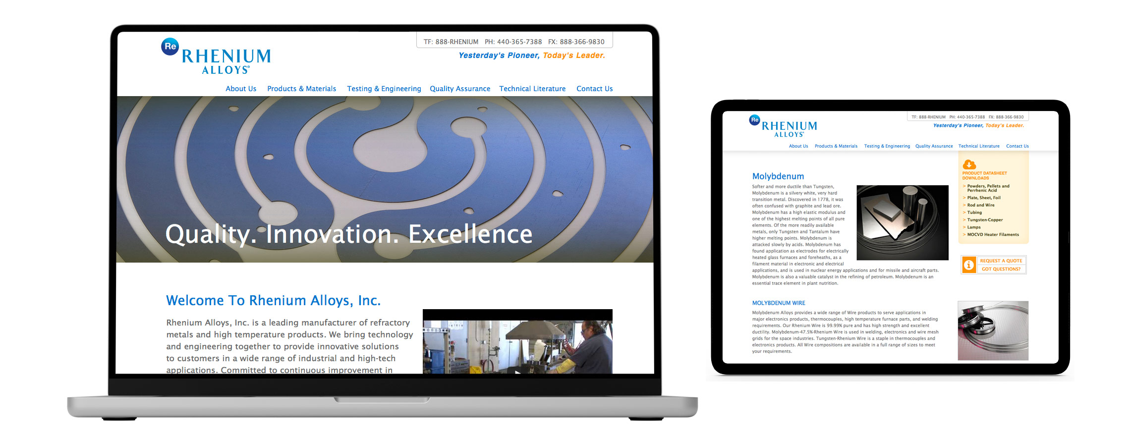
Rhenium Alloys
Website
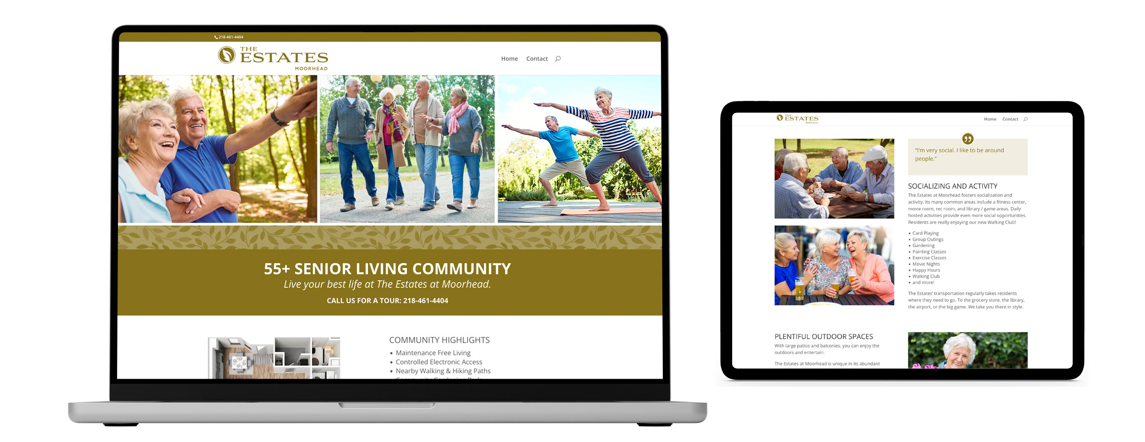
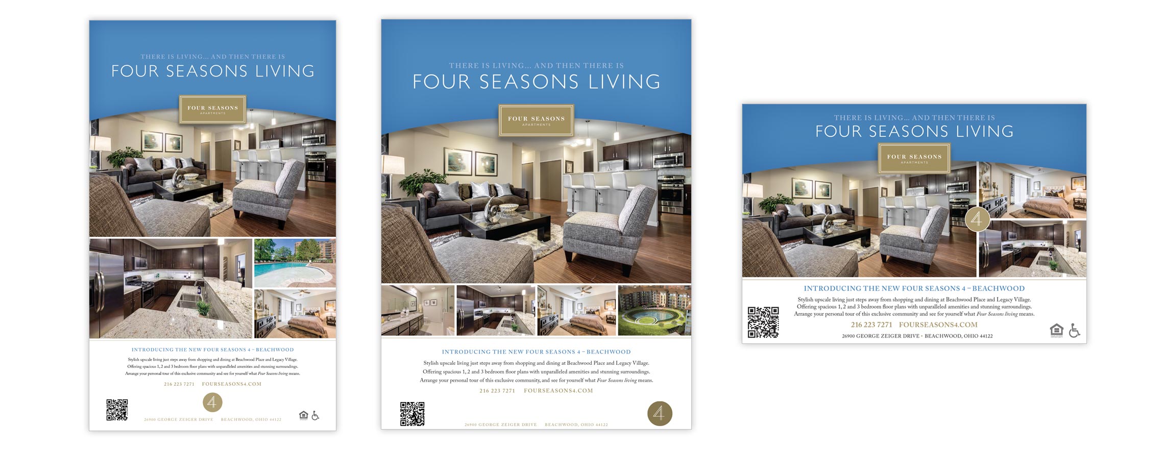
The Estates | Senior Living
Branding | Logo, Website
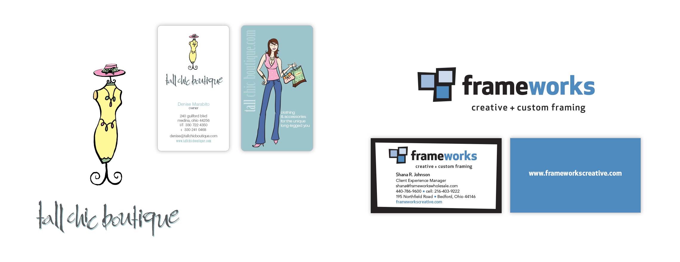
Various Retail Businesses
Branding | Logos, Business Cards
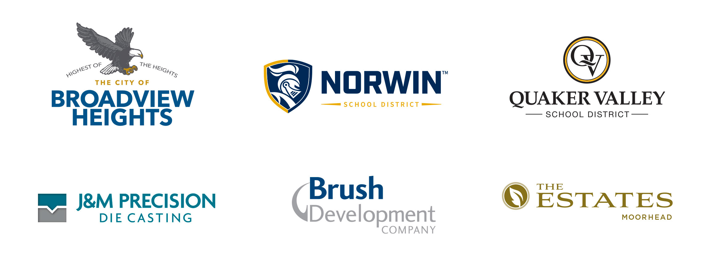
Various Businesses
Branding | Logos
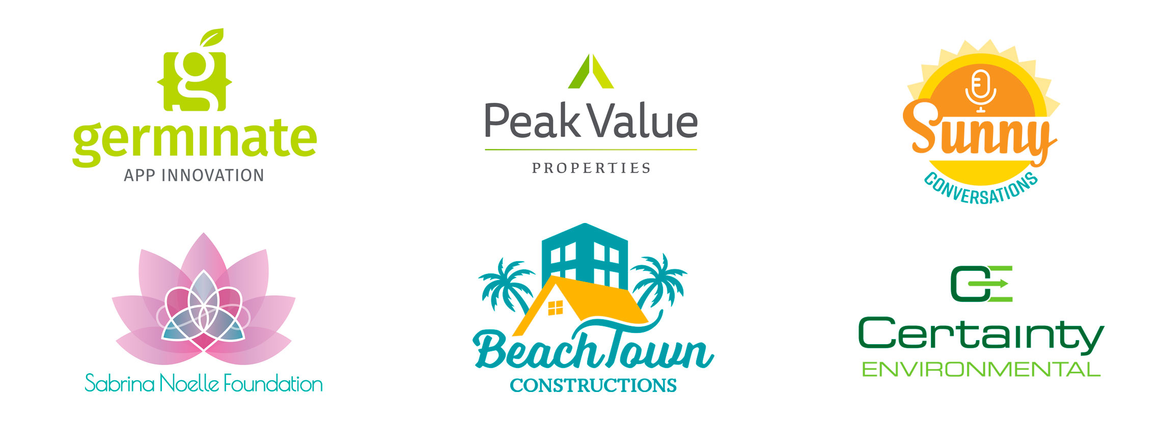
Various Businesses
Branding | Logos
Various Businesses
Branding | Logos
Aging & Dementia Portfolio
DESIGN FOR AGING & DEMENTIA
– Shara Bohach, Founder, Unity Design
Brush Development
Branding | Logo, Website
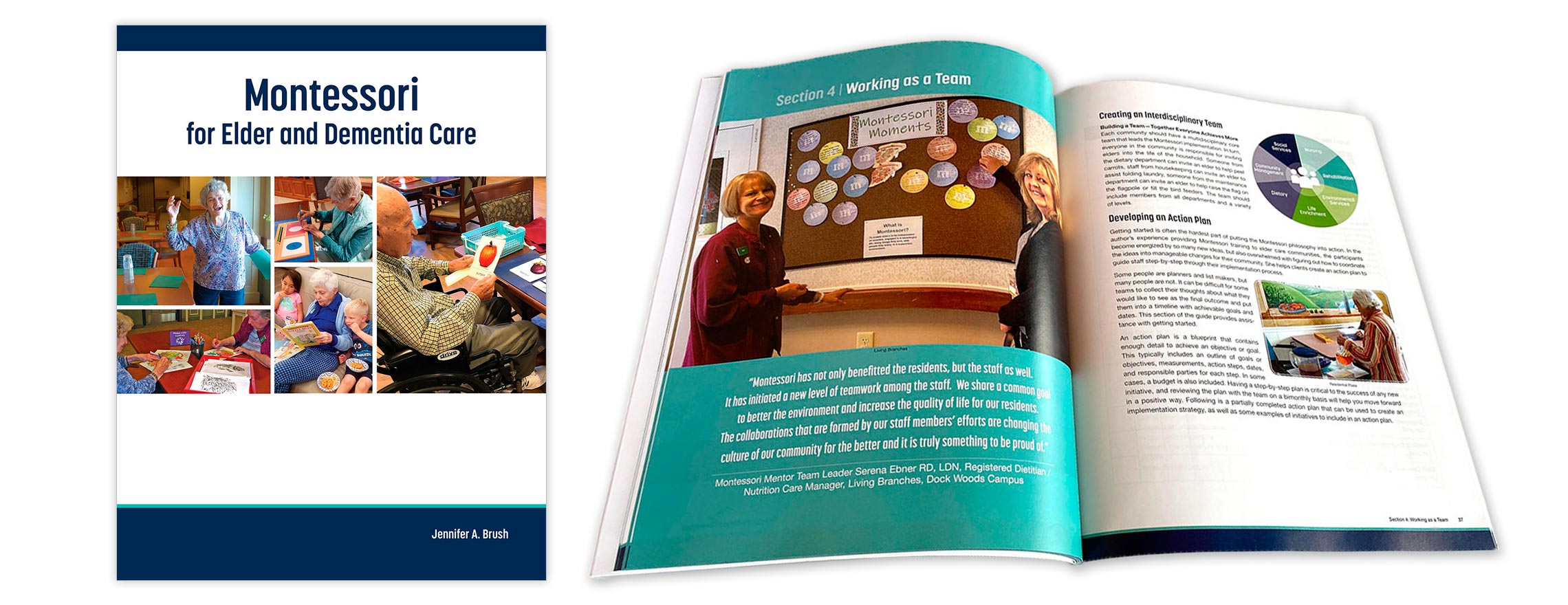
Brush Development
Book Design | Montessori for Elder and Dementia Care
Díaz Bras, Language & Memory Services
Website
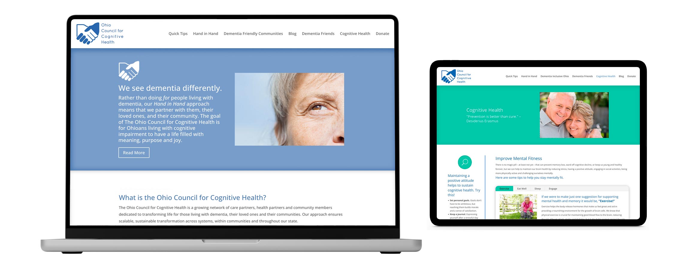
The Ohio Council for Cognitive Health
Website
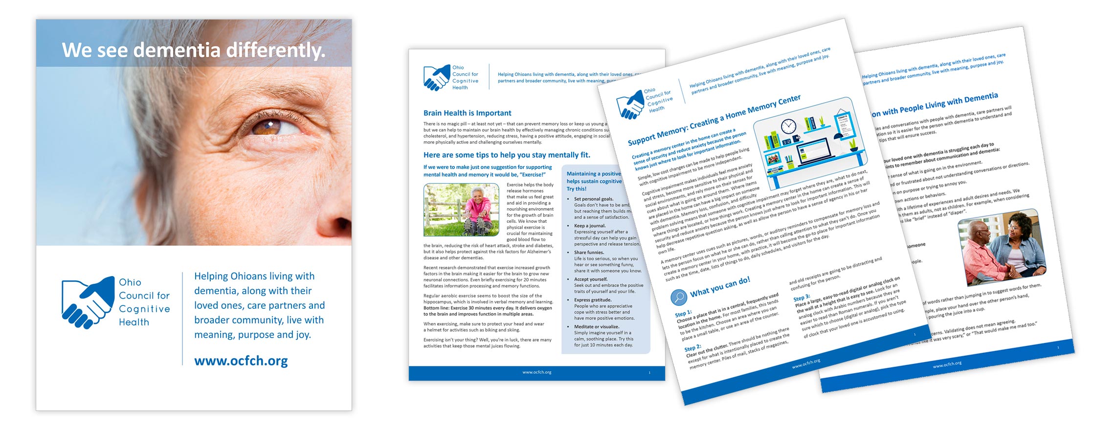
The Ohio Council for Cognitive Health
Collateral | Banner, Dementia Tip Sheets
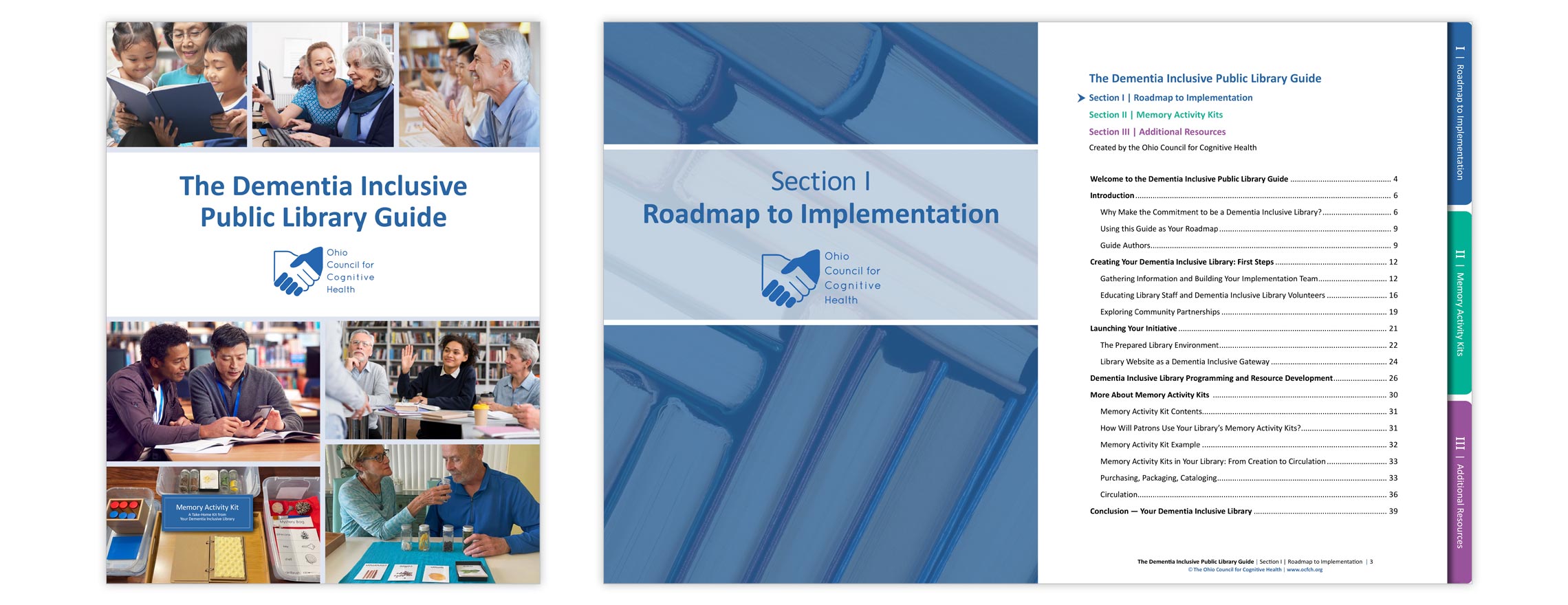
The Ohio Council for Cognitive Health
Interactive Book Design | The Dementia Inclusive Public Library Guide
Kansas State University
Branding | Program Logo, Book Design
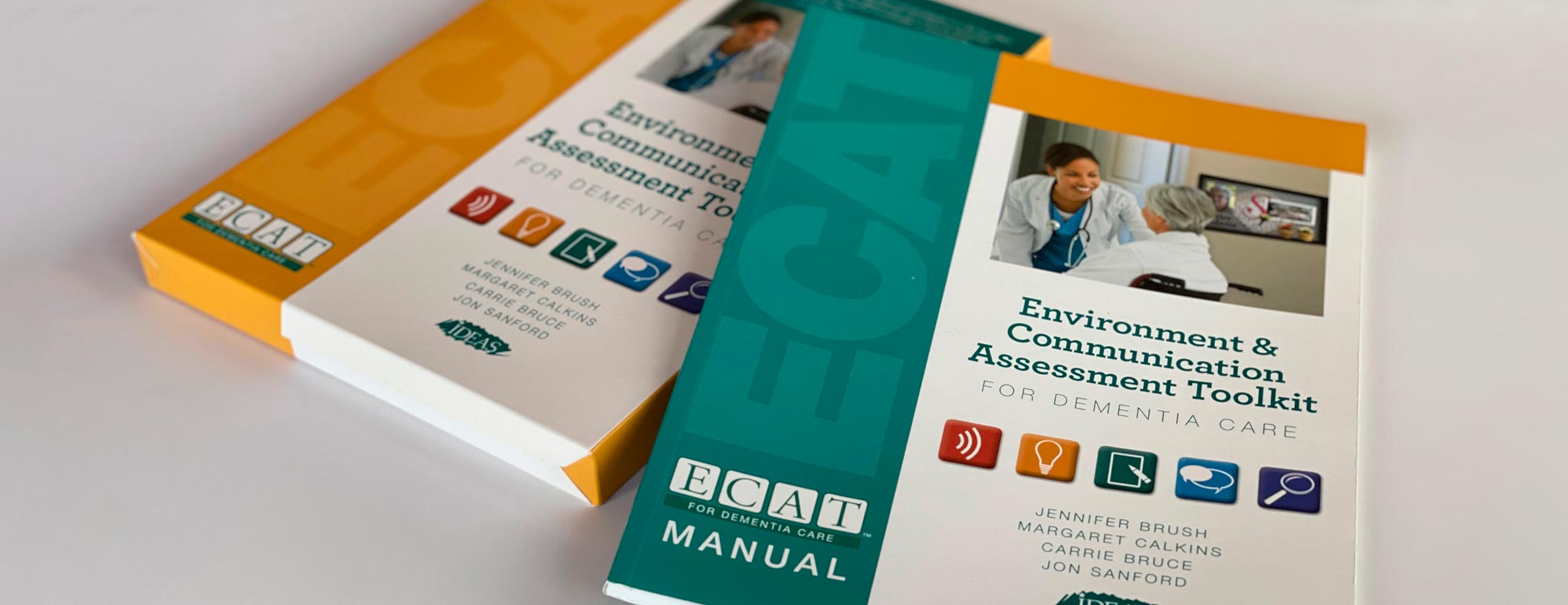
IDEAS Institute
Branding | Logo, Book Design
IDEAS Inc.
Product | Book, Workbook, CD, Packaging
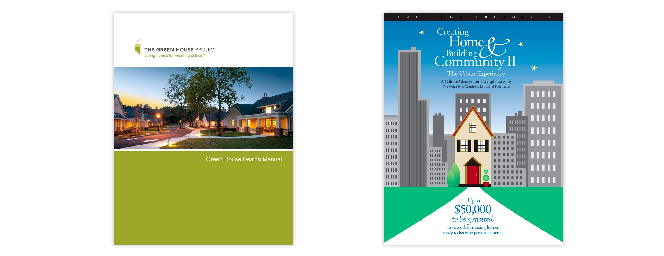
IDEAS Institute
Collateral | Book, Marketing Materials
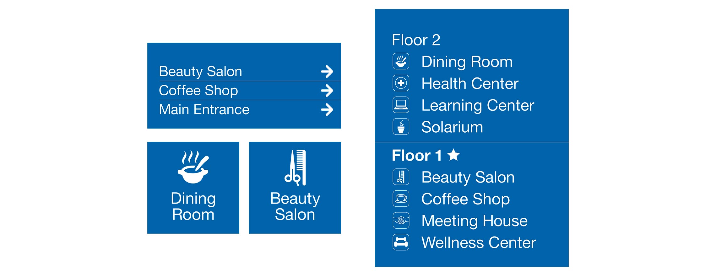
Grand Valley State University
Wayfinding Signage for Dementia
UNITY DESIGN ARTICLES & INSIGHTS
A Brand New Year – Take a Fresh Look at Your Brand
Les Dames d’Escoffier International | Cleveland Chapter Blog, January 2019 | By Shara Bohach, Unity Design
The new year offers the perfect resolution opportunity to re-evaluate your brand. To take a look back on the past year and realign your efforts for the year ahead.
Re-branding Les Dames d’Escoffier International
Les Dames d’Escoffier International Quarterly, Summer 2015 | By Shara Bohach, Unity Design
Unity Design increases brand awareness and unifies international culinary organization’s identity.
Working with the Team in Farm-to-Fridge (Branding the Avocado)
Les Dames d’Escoffier International Quarterly, Winter 2018 | By Shara Bohach, Unity Design
Shara Bohach covers LDEI Conference Session on branding The California Avocado.
2016 LDEI Legacy Awards Mentoring Tomorrow’s Leaders
Les Dames d’Escoffier International Quarterly, Winter 2017 | By Marsha Palanci
Shara Bohach Co-Chairs scholarship awards for women for international culinary organization.
2016 LDEI Legacy Awards
Les Dames d’Escoffier International Quarterly, Spring 2017 | By Shara Bohach, Unity Design
Shara Bohach, Co-Chair, introduces scholarship awards for women for international culinary organization.
Developing a Signage System that Supports Wayfinding and Independence for Persons with Dementia
Canadian Nursing Home, Spring 2015 | By Jennifer Brush, Cameron Camp, Shara Bohach, and Nelly Gertsberg
Unity Design develops Dementia Wayfinding System.